Thursday, February 9, 2017

PROCESS & PRODUCTION BLOG11
Study Task - 1 Weekly Journal

Development


Foreground and background
The environment throughout this animation is always set as the background, with the main characters at the centre of attention in the foreground because of what they are saying and doing sets the main plot points for this short story. The only time the environment is featured as the foreground is in the final scene when the restaurant burns down, otherwise the characters are featured formally throughout or walking through the scenery such as the door, but again they are approaching the foreground for the audience to recognise them.

Shape, 2 and 3 dimensional elements and camera angles Unlike my previous animations which feature a single viewpoint and don't express the environment through different angles and 3 dimensional drawings, this animation changes the audience’s perception of the world these characters inhabit by showcasing the most important perspectives. 


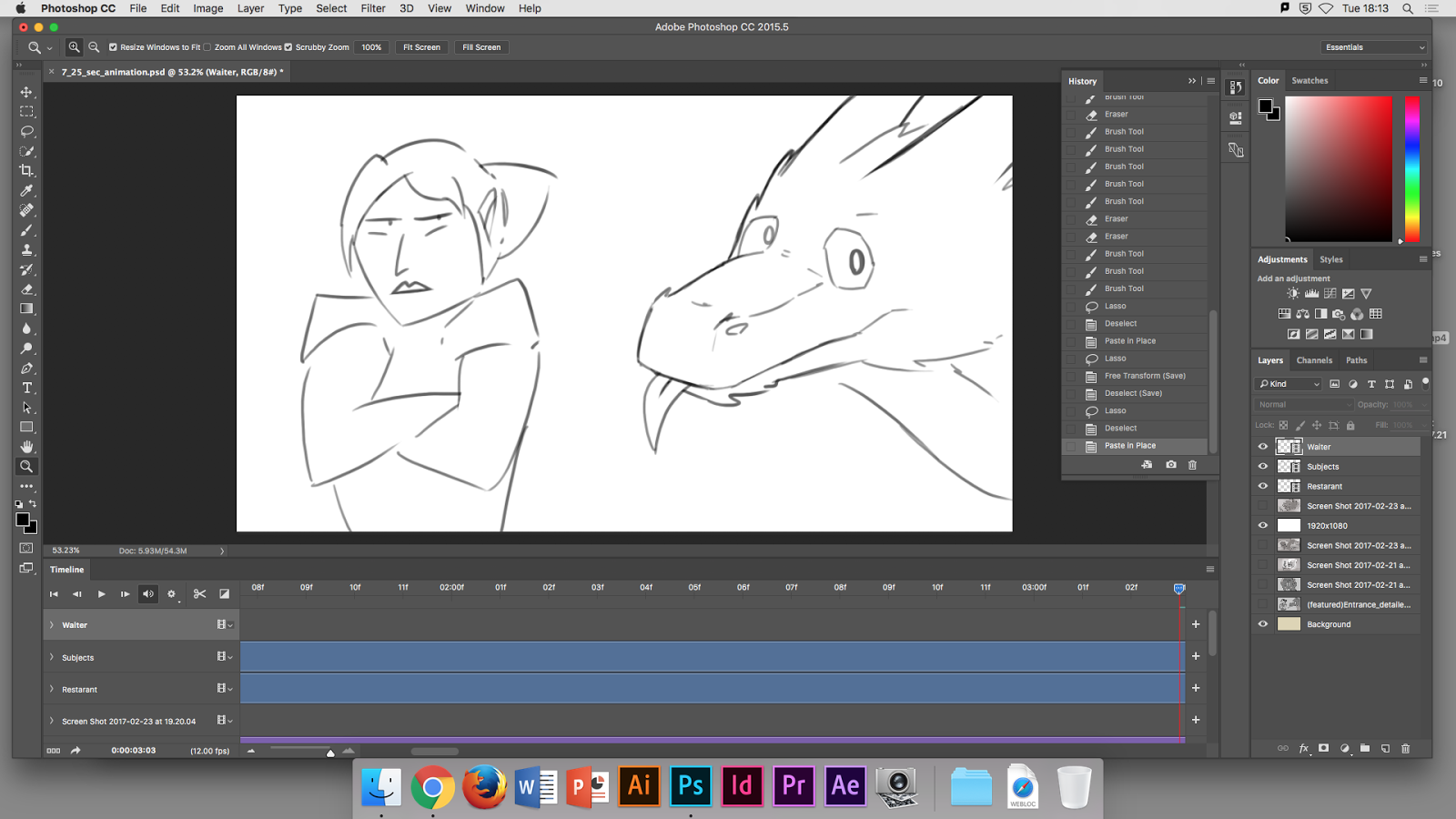
This is an important technique that I have found very useful because it helps set objectives for the plot in this fantasy world of my animation, for example the characters appear before a set of doors, the first incentive for the audience, but then you get a shot from their front, right in their faces as they discuss the main plot points (figuratively). 


Then the next shot, this could be of the first shot from behind again viewing the entrance as they enter the restaurant (would've been much easier) but I decided to challenge the perceptiveness of the audience by positioning the shot from inside the restaurant, although this scene is fast paced, it seems that the camera is always one step ahead of the actual characters and I feel that I have grasped the faster pace of short animations. 


The camera does slow mid-way through once the main plot points have been established and takes its time viewing the dragons accidents and the warriors overreactions by enhancing on her facial expressions and closer to the dragon every time he breaks something. 


Then in the final shot we see the exterior of the restaurant again as it burns, using the warriors fire breath to transition between the scenes towards the end like she had intentionally turned and flamed the audience.


Wednesday, February 8, 2017

PROCESS & PRODUCTION BLOG10
Study Task - 1 Weekly Journal

Process Development

Form and flow:


How my characters express emotion through body language and movement, sometimes to over exaggerate this with considerable body movement for humorous affect.

The waiter trips and falls, a moment before he trips he processed what is happening and then an explosion afterward with large arch's as his arms are thrown out in an over exaggerated way, then he uses his arms to catch himself towards the end. The audience don't have time to register his facial expression, that's why his body over exaggerates and expresses those emotions as he falls. I have tried to communicate most of the plot points without relying on sound, always challenging for animator's.


I have realised that duplicating the same frame to take up time makes the animation seem dry and too minimal because of limited detail in the motion picture, it becomes stale and boring. What I have done different this time is copy the same frame except making small changes in detail if the scene is slow, to create more action and movement also make it seem more realistic.


Using the 'Animators survival guide' to help structure my form and layout when using arch's, around the character performing tasks and actions which suggest the mood or expression by how they execute these tasks and body language.


When the warrior opens the door, I have tried to animate her posture to seem firm around her waist and back but arms and legs swinging in large arch's when she walks off, this is communicating attitude and moodiness that she is expressing through this action. Almost strutting with pride or, given the previous scene, arrogance and annoyance. 


Basic colouring


Based from the sketched drawings for my storyboard, these are then drawn again through a low opacity layer with low pressure on a graphics tablet. These drawings are directly drawn from the storyboard because I wanted to make the storyboard more accurate despite the fact it features mostly only key frames and more detailed animated in-betweens towards the end.


I created a colouring layer and used mostly bold shading and some blending for the tree in the background, I did this because of how simple the background can be around the characters who are the main focus of attention in the scene. They are taking most of the shot so that it seems like the audience is apart of the conversation between the characters, the expressions and actions of their conversation are the main focus because this is a plot point.


Once the background is drawn the characters are refined with full pressure bold black lines with brush size from pressure enabled.


Hiding the background as I colour the characters, I have chosen the developed character designs because of their simple colouring layouts and design.


Now the layers are made visible and sometimes I reduce the background opacity to help the main characters stand out with more contrast, using a coloured layer underneath that changes the overall colour variation for a warmer feeling (red) or colder depressing (blue).


Tonnage and shading 


Tuesday, February 7, 2017

PROCESS & PRODUCTION BLOG9
Study Task - 1 Weekly Journal


Characters, concept art, expressions and mouth sheet, poses

Researching images related to a warrior, medieval fighter, woman, maiden.


I like these knight statues because of all the detail in the armour and posture. These statues also hold the possibility of the person being a woman because there isn't and excessive armour parts and they seem to be well fitted, thin arms and neck areas, these are points that i'll be focusing on in the design. 


I am researching fantasy female warriors and mages as reference for character design and outfit layout. I'm aiming for chest plate and open arm cuffs, perhaps design based of barbarian with exposed arms and iron fittings around the waist, legs and feet.


This design combines features from medieval warriors and styled with barbarian outlandish theme sections around the arms and legs.   


Warrior:


Armour:
This warrior also possess magic and so she can be classed as a fighter with mage properties, her arms are bare because of this, her ability to use magic (apparent at the end of the animation) allows her to wear armour focusing on her chest and legs with minimal protection on her arms. The idea was so that she could move her arms more with out armour restraining her when casting spells with her hands. 
This design is easy to replicate for an animation, that is why there is minimal detail and open areas of armour on her arms. 

Personality:
The maiden will be designed with more realistic and iconic style, being the role model type and heroic, she will be more serious and concerned personality. Very prideful and honourable as a warrior, aggressive in nature and very little humour and angry most of the time (considerably worse with drink), direct and judgemental, almost ignorant when it comes to pride.

(Images of knights attitude and confrontation)


Design:
Her body is designed to look strong and sturdy and 


These detailed drawings show the dragon character and describe his posture, shape and design. They show his patterns and colour arrangement around his body, perhaps this design is too complicated to animate before the assignment deadline. 


Dragon 

My aim is so that the dragon can be related to by the audience as friendly and not be seen as a generically scary or evil dragon and because of his soft voice and friendly eyes, I feel that I achieved this despite his obvious dominating size, claws and fangs.

I also have realised that having round pupils on the dragon offers more relatable features for the viewer, compared to slit pupils because slit pupils are typically associated with a predator and also slit pupils generally don't convey any positive emotion and are quite a cold look for any character who isn't a villain or evil creature.


'
That's a human restaurant' - Boggis sounds like he's clenching his teeth, not because he's grimacing but because his words or speech is affected by his physical body being a dragon with large fangs and maw. (realism)
Cartoony, iconic or realistic?


The dragon will use more cartoony elements in his design because his style is more relatable and friendly to the audience, using rounder features and a large maw to hide his fangs, although this is a subtle feature hopefully it wont be interpreted as monstrous in the final animation, I want to maintain character design based from the character design.

Personality:
Calm, concentrating, curious, friendly, Sociable, Spontaneously aggressive if insulted (like a bull) very defensive and big (displays size with wings and hunched back).