During the stand alone presentation I showed my tutorial work with learning TVPaint11, mainly
I showed my progress on the typomania collaboration brief. Most of the suggestions are with the credits in general, saying how the text should slow down during the shot, and questioned the window concept.
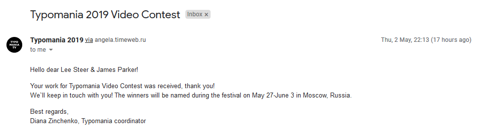
Having explained what the final animation would look like most agreed it would work, and is overall a good live brief to partake in.
Weekly goal:
Finish 3rd live brief for typomania, focus on my main animation.
Alebrije's are brightly coloured Mexican folk art sculptures of fantastical creatures.
The first alebrijes, along with use of the term, came form the figurine maker Pedro Linares. In the 1930s, Linares fell very ill and while he was in bed, unconscious, Linares dreamt of a strange place resembling a forest with all kinds of creatures, having similar resemblance to greek mythology creatures and mixed species hybrids.
All these creatures had bright patterns and colours on their complicated bodies, all different types of design and variation.
Featured texture and patterns for the creative design on these creatures:
Dreaming of the creatures, Mexico's indigenous and European past. In pre-Hispanic art, the brightly coloured images were often fantastic and associated with death or the concept of death, in elation to the next life or a different world.
Ideas:
At first I was sold on the Coyote to use as my creature. But then I found that the creature could be any type not just indigenous to South America/Mexico, and these Lions look great and very intriguing to design for my character design submission.
The reason being is because a lion would prove to be more rewarding, loose and appeal more towards the flashy aesthetic that the style of Alebrije's, with my style and approach in drawing:
I need to work on my animation, the whole project needs to focus on the animation now. Mainly because vital post production elements need to be experienced with for the final lighting effects and colouring.
Continuing to talk about my previous weekly group suggestions on keeping the colour to a noir black and white, is was suggested I use greyscale more and that the spotlights could even have colouring, like I originally planned but with minimal effects. Meaning the lights would not be low opacity but solid colouring, reflecting off the edges and parts of the characters and stage in the background in a graphical way. I will need to produce some more experimentation for this colouring style.
Weekly goal:
Finish half the roughs
I need to apply the expert feedback from David Bunting for my shots in the animation, using a grid for the whole perspective.
Based on my black cat character design, I am using this video as reference material to capture more feline movement in my animation:
Shot 1: 00:00
Cat: (Title screen is the centre of shot in the background, behind the stage ‘The Black Cat’ band name with logo) Shot 2: 00:07 - 00:11 - 00:14 - *Cat jumps on stage in foreground and begins walking under silhouetted tall propped up guitar and microphone, on stands high above Cat, title screen and logo overhead* (Similar to the outro, the intro starts with a fade in, using a black and white desaturation effect into colour).
Based on my cat characters animated turnaround, I can confidently replicate his design with accurate feline movement and action.
Here is a quick preview of some rough animation of my black cat, focusing on the joints and the way a cats feet would move as my character, this animation has yet to be refined, but I am confident with the way it looks so far:
Here are some rough key frames for my walking sly cat, these are poses that I have drawn ahead of the walk cycle to key frame the rest of the animation. These poses are based on the referencing cat video:
I asked for some video reference as guides from James Jarvis the musician I am collaborating on with this project, for more accurate instrumental parts.
Here are the scripted shots for developing with animation, on these videoed segments of keyboard and bass guitar, these are the only parts where the instruments are noticeably played on screen, according to the animatic:
Shot 10: 01:01
Cat: *Jumps up on long looking abstract keyboard synthesiser, walks slyly again, pressing neon looking colourful setting keys, and jumping hesitantly at the sound effects each time.
Shot 11: 01:03
**Cat plays some odd keys matching the music, and is brushed off by band member**
Shot 12: 01:09
Again, another spotlight lights up the keyboard with the cat on top.
Cat: (Shot zooms out to show the surroundings in the light) *Jumps in surprise*
Keyboardist/Synthist female character: *Hand reaches down after cat to play synth:
Shot 18: 01:32
Cat: (Still in the guitarists 1st person perspective) *Gets distracted from being pet, watching the hand moving to pick up the bass guitar instead*
Shot 19: 01:33
Cat: (Jumping off the bass guitar in surprise, as it is suddenly picked up and played by the guitarist).
Shot 20: 01:36
(Camera zooms out further to show all characters playing their song, cat jumping off stage similar to how he entered the stage).
Shot 21: 01:38
*Lights all change colour to white and dip low, showing a darker stage and silhouetted characters, but the screen at the back with the logo starts glowing, showing the cat head logo*
Shot 22: 01:40
(Camera Zooms towards the main singer, similar to previously, showing the first half of the stage with drummer and synth characters). *One of the spotlights dipped low at the back, moves to focuses on the singer in the same shot*
My peers like the LoopdeLoop live brief, Pig Gif I have recently submitted to the website, mostly the colouring and textures, but also the 'style of animation', this is mostly in relation to the character designs in the animation and each of their actions in the scene.
One of the presentations I really liked and I asked about it for the pylonanimations contest, Ollie showed me about 'overshoots' when animating the squash and stretch, which is a purposeful exaggeration for fast actions and effect.
Linking me this Instagram account that goes into more detail about this technique for more attractive and interesting 2D animation, that inspired Ollie in his research.
Title sequence design for twin peaks themed episodes
I am collaborating with a graphic designer, Lee Steer, to produce three episode title sequences for this competition brief:
We have decided on 'Movie title. Captions for movies, cartoons, TV series, TV programs.' Further meeting and discussing with the Graphic Designer about the themes he has in mind.
He will be researching and experimenting with some help from me, to decide the designs and animation for the three themed title sequences for each three unique episodes.
Brainstorming ideas, based on featuring Saul Bass design style as a visual influence, according to the Graphic designer, and binary oppositions, contrasting based on his experience and studies, concepts and ideas:
These are all things we considered for the project type and style that reflects the overall theme of the film series.
Lynch on Lynch by David Lynch & Chris Rodley
- Uncovering the darkness beneath the mundane.
- A threat that cannot be controlled by tangible means.
- Confusion of interior and exterior.
- Slowly unravels.
- Trees and traffic lights.
- Green to red.
- Juxtaposition of nature and man-made horrors.
- Good and evil binary oppositions.
- White and black lodge.
- Duality of man.
- Laura Palmer: "Radiant on the outside, dying on the inside" - David Lynch
- Presence and absence.
- Doppelgänger.
- Abstraction [of the] human form.
- Celebritization in a local setting.
- Bricolage of genres.
- Attempt to create a title sequence for all of these genres simultaneously.
WINDOWS as the binary opposition concept.
Paranormal, different dimensions,
Example film for researching themes:
Surrealistic themes, darkness invading the light, good invaded by bad.
Dark characters, influencing the dimensions, physical manifestation of a dark spirit
Based on these themes and concepts I will be designing some ideas based on the series:
Twin peaks was one of the first to push the boundaries, German expression, harsh angles, angular, strong contrast.
Taking ideas form reference and exploring other popular minimal openings and title sequences such as Saul Bass, which also suites the binary oppositions theme:
The window concept is the strongest concept for this Twin Peaks project we agree on, mainly for the binary oppositions of contrasting white and black, as light being invaded by the dark, shadows and textures. I am prompting to start producing the idea, rather than spend too long on idea creating, the graphic designer I am working with, so these are the final experimentation concepts.
Typography:
Using Illustrator for...
Developing these concepts, this is the final design for the title sequence, we have together planned the storyboard, mostly basing it off the researched design preferences as stated with some extra typographic elements.
Final Storyboard as specified by the graphic designer collaborator:
Submission:
We thought that the title sequence could use one of the songs from Angelo Badalamenti form the series. This is not a requirement in the Live Brief typomania, but based on the Twin Peaks intro theme, this fits our sequence well.